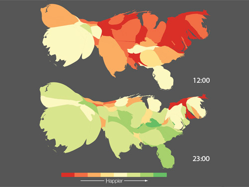
Computer scientist Alan Mislove at Northeastern University in Boston and colleagues have found that these “tweets” suggest that the west coast is happier than the east coast, and across the country happiness peaks each Sunday morning, with a trough on Thursday evenings. The team calls their work the “pulse of the nation”.
To glean mood from the 140-character-long messages, the researchers analysed all public tweets posted between September 2006 and August 2009. They filtered them to find tweets that contain words included in a psychological word-rating system called Affective Norms for English Words – a low-scoring word on ANEW is considered negative, a high-scoring one positive
That left 300 million tweets, each of which was awarded a mood score based on the number of positive or negative words it contained. For example, “diamond”, “love” and “paradise” indicate happiness, whereas “funeral”, “rape” and “suicide” are negative. “Dentist” is fairly neutral.
Finally, the researchers calculated the average mood score of all the users living in a state hour by hour and so created a timed series of mood maps. They morphed the maps so that the size of each county reflected the number of Twitter users living there.
Steven Gray at University College London, who also crowdsources data through Twitter, agrees. For all of the problems with decoding the data, “Twitter offers researchers a unique, live data set that changes by the minute”, he says.

Wow this is really interesting and shows again in which ways the data gathered through social media sides can be used. But I think we have to look at this with a grain of salt. It coul for example be that people on the west coast just use twitter diffentley than people on the east coast. I would probablz post more positive stuff than negative, because negative emotions often reveal more personal feelings I think. I wonder if they took things like this in account.
On a diffrent note I like how they illustrated the percentage of people using twitter with that map. It rememberd me of this project: http://show.mappingworlds.com/world/ You can select a subject and the countries on the map change their size. Instead of land mass, the size of each country will represent the data for that subject. Relly cool!